If you have tried to use Excel’s new(ish) chart to map feature you will find how easy it is to use. However, it does only supports Countries and Provinces/States, so if you try to INSERT > CHART > MAP with city data you will see:
MAP CHART NEEDS GEOGRAPHICAL DATA SUCH AS COUNTRY/REGION, STATE/PROVINCE OR POSTAL CODE. CHECK YOUR DATA AND TRY AGAIN
- Insert > Chart > Map – Error with City Data
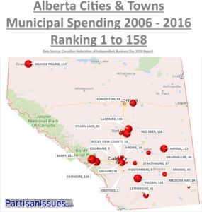
- What you want your chart/map to look like
However, there is a very simple way around this problem as shown in the video below:
- Insert > Chart > Bubble Chart – ignore how bad it looks
- Note that Latitude and Longitude in the columns to the right of each city
- Set your chart boundaries to the lat and long’s
- Set the data to the appropriate ranges
- Replace the background with a graphic of the region you want mapped
This sounds more complex than it is. In this video we show you each step and that it is not that hard to do.


3 Comments
M Rick · February 21, 2024 at 11:11 am
I have followed these instructions at least 5 times and cannot get the bubble points onto the graph after I have formatted the axis. I have triple checked the x axis is Lat and y axis is Long. Prior to formatting the axis, the bubbles were present on the graph. I cannot figure out what is not working. Any help would be appreciated. thank you
Fiorella · June 27, 2019 at 11:34 pm
Thanks! I was not able to find an app where to select a map with user defined boundaries (in our case lat-long). Suggestions?
Ian Matthews · June 30, 2019 at 12:18 pm
I am sorry but I don’t understand what you mean by USER DEFINED BOUNDARIES. If you can clarify, we can likely help. 🙂